Zendesk
Simplifying the navigation and search on the internal help center for Zendesk

Foreword
It’s a great privilege for us to be trusted by Zendesk. We were happy to create an easy-to-use internal help center for them that makes their employees’ daily jobs easier and enjoyable. This is a story of how we worked with Zendesk to help them solve their challenges with the internal knowledge base.
“What I love about Lotus Themes, is that they were very transparent and they didn’t push any solution on us that we didn’t really need.”
Valeria G., Zendesk
Challenges
Zendesk’s Customer Marketing team creates a lot of content that was originally delivered and stored in different places. Internal teams constantly reached out for help with basic questions that they could have searched themselves if the content was located in one user-friendly solution.
Articles were related to specific attributes such as topic, region, industry, etc. In order to group them this way, Zendesk’s team had to add these labels to every Guide article. So, the homepage had a list of all filters that took up a lot of space. It was also inconvenient that every time users selected or changed them, they had to click the “Filter” button.
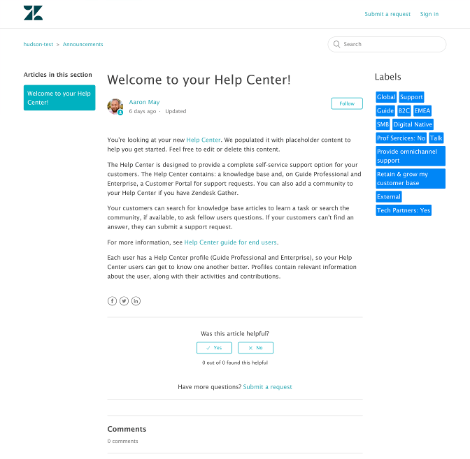
The internal knowledge base displayed all articles in one column under the filters. It made the content messy and more difficult to digest. The article page had a list of labels on the right that took much space and looked cluttered.
Zendesk’s team was comparing different solutions but chose Lotus Themes for the great value, responsiveness, fast delivery, and transparency. They also liked the variety of modern, high-quality templates that help visualize how that would work and that other vendors don’t offer.
“Lotus Themes was the best solution in terms of price and value, and they were very-very responsive and willing to listen to our needs and provide the best solution.”
As a large corporation, Zendesk is concerned about security. To obtain access to their internal help center, our company was required to be onboarded as a service provider and complete a background check by HR, which we did successfully.
Solution
“Lotus Themes made it clear that what we needed wasn’t that complicated. We needed to focus more on customization rather than spending a lot of time and money on the feel and look.”
We listened to Zendesk’s needs and problems with their current help center and proposed solutions to achieve their goals considering Guide functionality and possible workarounds. The main task for Lotus Themes was to make the internal knowledge base user-friendly and simplify the filtering of articles by labels on the homepage. After our development team studied the content and current implementation, they decided to take the Mink theme as a basis. It was branded according to the corporate style guidelines and customized to be in line with the Zendesk’s main help center’s design.
We changed the layout of the homepage, which is now divided into two columns while being also mobile-friendly. Filters are displayed on the left, and articles are on the right. It allows Zendesk’s team to present more content on one screen and makes the interface more intuitive. We added the category tree “Getting Started” containing two sections from the original Mink theme.
“Lotus Themes proposed a solution based on our circumstances. We were flexible and open to their suggestions because Lotus Themes are the experts.”
Labels
One of the main Zendesk’s goals was to classify all articles by labels and simplify navigation and search on the internal help center. So, we decided to display groups of labels with dropdown menus on the left.
When the user selects one of the labels, the category tree “Getting Started” is replaced with the relevant articles. If the user chooses two labels, only articles that relate to both of them appear on the right side of the homepage. The “Filter” button was removed, so the results are displayed immediately as soon as you select a filter. The data is cached; there are no additional requests to Zendesk API.
We started our work with prototyping and agreed on the layout concept with Zendesk:
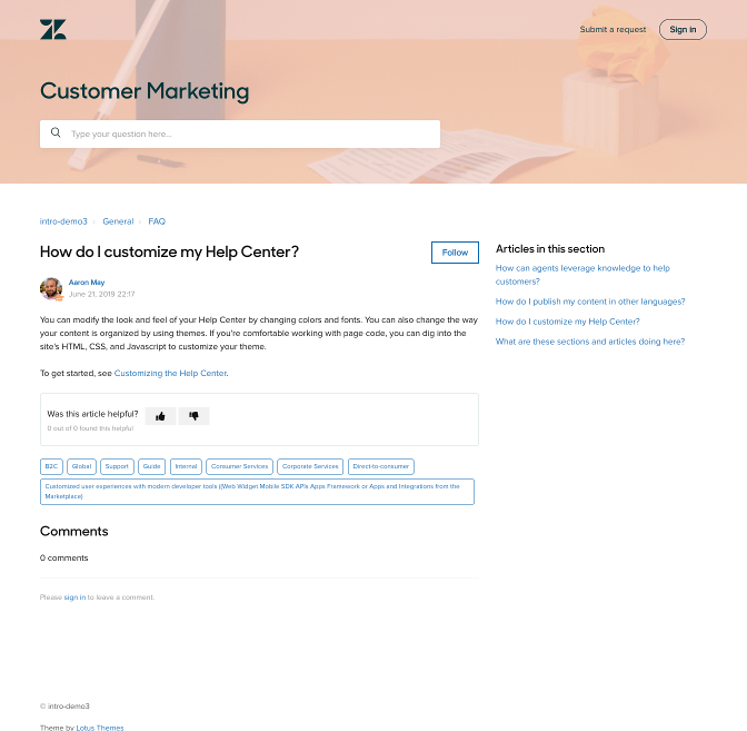
In order to make articles and labels look neat and clean, we moved the labels from the right column to the bottom of the page like this:
As a result, the block with labels on the article pages looks prettier, and it takes less space.
“The help center dramatically changed from what we had before.”
On the right, we added Related articles.
Results
The help center redesign for Zendesk impacted their core metrics to empower the Sales, Marketing, and PR departments with knowledge. It is super easy to use, and the filters work fine. The team is more efficient by delivering content at scale
“In the first month, we have had over 5,000 page views and 3,600 unique page viewers. Everybody loves using the help center.”
Zendesk employees are very grateful for how it got faster and easier to find the information they need for their work with customers. They can search for marketing materials, customer stories, quotes, and videos quickly. If they don’t find something or have questions, they reach out by submitting a ticket instead of using emails because this option is visible at all times in the header.
“I had to message you because the Customer Marketing Center is so amazing and easy to use. I have now been empowered to use customer service examples because now they’re easy to find. I just wanted to say thank you so much.”
One of the messages from happy users.

“Now we have one unified place to find all information. And it makes it really easy for me to do my job because I also use the help center to find answers for people’s questions.”


