2021 is just around the corner, but is your Zendesk Guide design keeping up with the times and meeting your users' expectations?
The quick-and-dirty design has long been a thing of the past; customers have become more demanding, and competitors are more advanced. Today, modern design is an indicator of a successful growing brand that you want to work with again and again.
We, the Lotus Themes team, create Zendesk help centers that reduce support costs through beautiful and intuitive design. That's why we want to share with you the Zendesk design trends for 2021, as well as tips and recommendations on how to work with them, what you should pay attention to in your work, which way to develop, and which tools to use.
Trend 1: Perfect Icons
In 2021, using inconsistent icons is merely unacceptable. Zendesk Guide interfaces in 2021 should be polished down to each pixel. It's worth it to pay special attention to icons.
Tip
If you want to keep up with the trend, don't use icons from different sets. Don't download various icons from stock sites, but use specialized ready-made libraries. All icons should be in the same style, with the same parameters and line thickness.
Icons from different sets in the interface disrupt the integrity and accuracy of the help center. Use new icon libraries. They usually have a more modern look.
Where can you download free, good quality icons?
- Streamline symbols. We often use this pack when we customize Zendesk help centers. 1,285 free icons for Visual Studio; SVG is also available.
- Basil
- Ikonate
- Phosphor
- Radix Icons
- IconPark
- Iconly 2
- Iconhub
- Heroicons
- Rubicons
- Tabler Icons
- Hicon Pack
- Remix icon
- Boxicons 2.0
- Vue Unicons
Trend 2: Minimalism and Simplicity
There have been many experiments in the history of interfaces. Today the design has concluded that a good interface is an interface that is not visible. The same can be said about Zendesk design.

Zendesk Guide design for Nokia
If you notice, many sites and help centers look the same. They have removed the color from the main menu and made it white. Some did it earlier, some later. But the trend is the same for everyone: minimalism, a minimum of accent colors, a lot of space, and content in the spotlight.
Get Zendesk design ideas from CX leaders right to your inbox
Trend 3: Pastel Colors
With the arrival of minimalism and simplicity in the UI design of websites and Zendesk help centers, pastel colors perfectly complement the new trend. They fit well into the concept of an unobtrusive UI, don't overload the design, and maintain lightness. They set the tone and atmosphere.

There's nothing complicated about creating pastel colors: just make your design backgrounds as bright and delicate as possible. So that they fit well with the overall concept and graphics.
But if you don't know what colors to choose for the design of your site and help center, use Color Hunt for help. They have ready-made patterns with pastel colors for every taste and color.
Trend 4: Shadows and Gradients
The trend with shadows and gradients started earlier but remains relevant. The only thing that's changed is the appearance of more airiness, lightness, and volume. All this is mixed with pastel gradients and new trendy 3D icons. In fact, this is the same minimalism, only more voluminous.
Tip
Use more muted and pastel colors and shades for shadows and gradients.
Complex gradients and blur effects
Gradients have also evolved a bit and become more complex. It's no longer enough to use a linear gradient like before. You need to mix different colors and use an overlay. Plus, the Color Blur effect is increasingly used in interfaces. Most often as a background. It gives the interface depth and volume. As a rule, they're a kind of "color spots."

Zendesk help center design for Terminus
Trend 5: 3D Icons and Illustrations
3D icons and illustrations are simple shapes and relatively simple and primitive objects. Still, they look great and fresh as a visual for websites and Zendesk help centers.
Tip
Don't rush to use free 3D icons and illustrations now. The trend is in full swing and will be fully formed a little later. Ideally, order custom graphics from 3D designers.
Over time, there will be more offers and collections for purchase on the market you can safely use for your sites and help centers. Now, every other person will use the same free icon from the available and free collections, which are very few at the moment.
Trend 6: 2D Unique and Absurd Illustrations
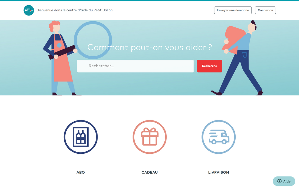
Illustrations, as last year, remain a trend. There is only one problem, like with icons. There is a considerable number of the same type and available illustrations, which significantly devalues them.
Using free libraries of seemingly good illustrations, they all look the same. They just get boring. Although a couple of years ago, illustrations like this were simply fantastic. But it doesn't mean we should totally abandon them. You can use them, but try to find something unique and different from everything else. Better yet, create something of your own.
In 2021, the trend will be original illustrations that are not like anything else. And the bolder they are, the better. 2021 is the golden age for illustrators. They definitely shouldn't be out of work this year.
Anything from simple to intricate illustrations works excellent. The main thing is to use fewer free libraries and have more creativity.

Zendesk design for Petit Ballon
Absurd Illustrations
Yes, absurdity and crazy rule. Break with logic and be surprising.
2D illustrations are perfectly combined in help centers' UI design with the new style of 2021. They look just as good as 3D illustrations.
Trend 7: SVG and JSON Animation
In 2021, there will be many good illustrations, but they'll get boring to look at. To make them even more interesting, they'll be animated. The trend is already emerging, and animated illustrations are appearing. This applies not only to illustrations but also to icons.
Any small animated details in the interface, especially where appropriate, will be a big plus.
What is SVG and JSON animation? Simply put, it's animation generated by code. What are the advantages?
- iOS, Android & Web. Universal use on iOS, Android, Web, and Windows.
- Minimum size. Animation files are tens or hundreds of times smaller than graphics in size.
- Smart settings. Animation's reaction to any interaction and controlled display.
You need a programmer to create an animation and integrate it correctly, with support for all browsers and correct display. But this doesn't mean that the designer can't create animation and work closely with the programmer or use animation tools. Here, instead, we are talking about collaboration between a programmer and a designer.
In any case, the animation trend will continue to develop, and it's mainly a team effort: product manager - designer - illustrator - animator - programmer - tester.
The designer can visualize the animation in After Effect and then pass it on and show it to the programmer. Today, there are no ideal animation tools and editors for a designer that meet all the necessary development requirements. When the designer transfers code from the visual editor to the programmer, it is sometimes too big, sometimes not supported everywhere, and so on. A Gif animation, in turn, can be quite large.
Summary
2021 is the year for developing 3D graphics, illustrations, animation, and font diversity. UI design of sites and Zendesk help centers goes into minimalism, lightness, and simplicity. Particular attention is paid to details. The interface is becoming less visible and unobtrusive.
Apply these trends in practice. Your customers will use your help center even more often instead of contacting support agents.
If you would like to customize your Guide instance but don't know where to start or just don't have enough time, you can always contact Lotus Themes, a Zendesk partner for help center themes and customization.
Take a sneak peek at the best Zendesk practices from CX leaders before building your help center
